If you are looking for Photographer Branding Inspo, you’re going to want to read this.
Our team worked with Jess Biancardi on her creative rebrand & website design this past spring. We call this service The Triple Threat, because photographers walk away with a complete brand transformation in the realms of branding, messaging, & web design. Keep reading if you want approachable & personable photographer branding inspo.
Jess wanted a colorful, personable, and approachable brand that mirrors her personality and helps her attract higher-end wedding photography clients. She knew she wanted something cohesive that’d signal to potential clients she’s the real-deal.
The truth is, Jess gives her clients such a personable and attentive experience. She’s insanely organized, wonderfully communicative, and her attention-to-detail is second to none. She wanted a brand that reflected her values, not something that felt like an afterthought.
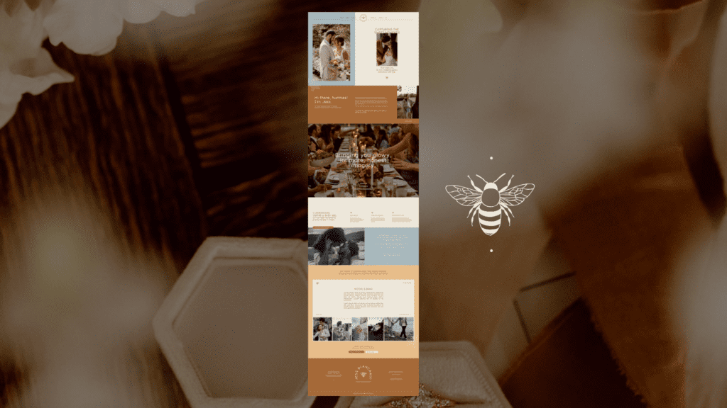
Reading through her site, you can see it sprinkles in Jess’ sweet personality. The first line you’ll read says: “Capturing the sweet moments for couples who want to reminisce with joy.” This line sets the stage for the glowy, honest, intimate images that are central to Jess’ brand.
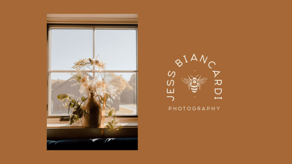
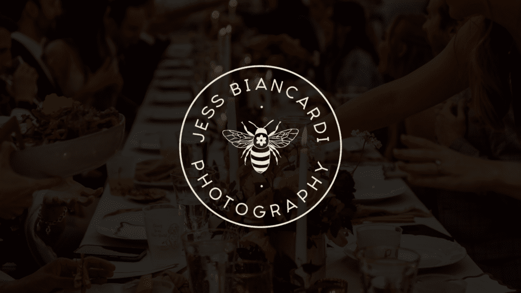
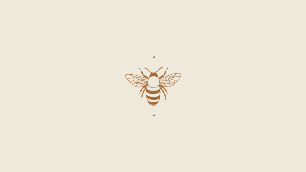
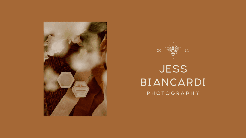
Our team creates custom, hand-drawn illustrations to add an extremely personal element to your brand. For Jess, we created a bee illustration. This bee emblem is central to Jess’ personal value of sustainability and her love of the outdoors. It also serves as the sweetest reminder to her couples to stay true to themselves and their story on their day.
The Exact Methodology We Used for This Project
We use our Cohesive Brand System during every project to ensure we launch something strategic & stylish that gets results. (AKA effective brand positioning, greater brand recognition, and higher sales.)
We also make sure to customize the method to each client in order to ensure each photographer ends up with something fully personalized to them.
Adapting this methodology to Jess’ brand was so much fun.
Website Messaging
We start every project with a 90 minute Zoom call where we do a strategy deep-dive. This is when we’ll chat about your target audience, core values, unique selling points, & personal voice. We’ll drink coffee, chat about your business, and create a bank of information that will be turned into your website copy.
We decided we were going to use bee iconography for Jess, because it represents so much that is important to her, while strategically distinguishing her from other photographers.
You’ll notice copy throughout her website that nods to the bumblebee you see in her logo:
“I understand you’re a busy bee so I’ve made the booking process simple ‘n sweet”
“My Past Clients Are the Bees’ Knees”
“Swing by my portfolio or buzz on over to book!”
This messaging strategy is commonly used to form a close connection between an element (in this case a bumblebee) and your brand. By including the bee in Jess’ messaging and visuals, we nearly guarantee that anytime someone in her target audience sees something with a bee on it, they’ll also think of Jess’ brand.
It’s also a fun way to add an unrelated element to brand to add contrast and memorability. Generally, a bumblebee has little to do with wedding photography. But by incorporating it, we add something fresh, fun, and above all, memorable.
Logo & Branding Design
After we finalized the messaging, we worked to perfect the logo & branding for Jess’ new site. This meant creating a custom bee illustration.
We create mood boards early on in projects to get the photography branding vibes just right.
We always recommend this step before diving into design. Pinterest is a great starting point. You can look up things like Photography Branding Inspo, Photography Inspo Pics, & Color Palette Ideas to get started.
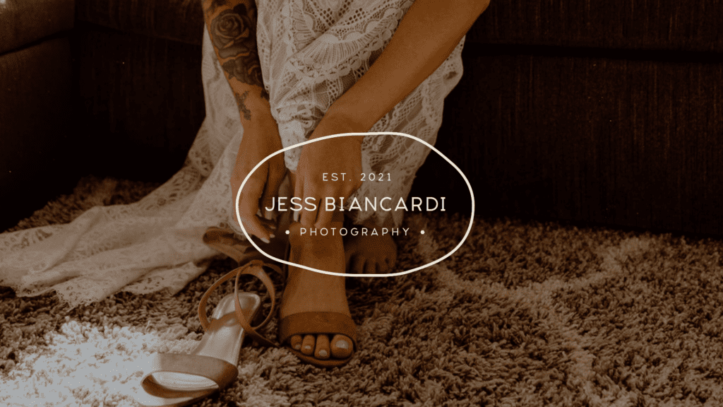
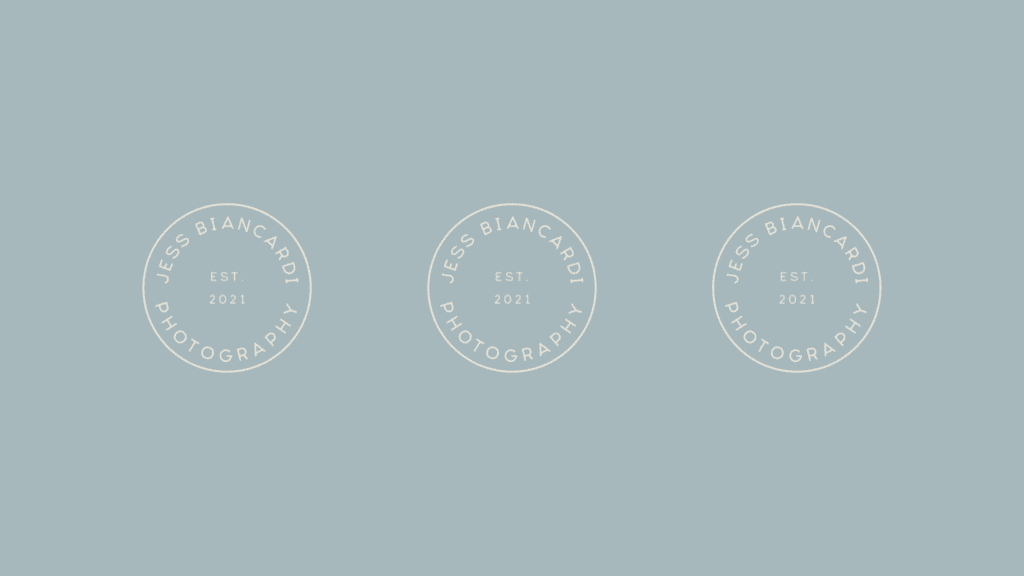
The color palette we selected for Jess is bright, yet refined. This pairs well with the tone of the messaging and the vivid colors in her photos. Our team knew we needed a logo suite that was legible and welcoming. We paired a boxy serif with a super legible one to create a duo you’ll see throughout her brand.
We always create multiple logo variations for our clients. This is so you can create on-brand content and collateral that’s cohesive without being redundant. Clients will use a few logo variations on their website and may use the others on social media posts, business cards, and more. The beauty is how versatile the designs are.
Website Design & Development
After Jess approved all of the design and copy for her website, we started the website design phase. In this phase, we combine the branding and messaging we’ve created thus far and turn it into a 5-page website. During the first phase, we design the website. We create something with Jess’ target audience in mind. We answer questions like: What’s the age group of the typical person navigating this site? How can we optimize the navigation and flow for this audience? How can the website enhance the messaging and brand design we’ve created so far?
During the second phase, we develop the website in Showit. This is the most technical phase of the project and takes a few weeks. We take the static designs and bring them to life in a fully developed website.
Jess’ website design included 5 pages filled with click transitions, parallax scrolling, & custom honeycomb graphics.
You can view her finished site HERE.
*NOTE: Since launching her project, Jess added a blog and a mentorship page to her site herself using the elements we created for her! These pages are lovely, but weren’t designed by our team.